5 COLOR AND DESIGN TIPS FOR REMODELING YOUR HOME- FROM LISA THOMPKINS
Color is one of the most powerful tools in our lives that can change how we view spaces and shift the way we interact with our homes. If you’re considering updating your home’s color scheme, keep these tips in mind!
1. GET TO KNOW THE COLOR WHEEL
Before getting started, it’s a good idea to get to know the color wheel. The general color selections people go for are nearly monochromatic out of fear of doing something wrong, but luckily it’s incredibly easy to make this exciting! If most of your home is hues of green and teal, you can play with this by allowing pops of coral. You don’t have to cover your home in shades of coral, but at least one pop of coral in any area that’s covered in green can allow a sweet complementary color scheme to play. The three main color schemes people go for are monochromatic (all one color in varying shades), analogous (similar colors like orange-red and yellow together), and complementary colors (colors that sit opposite each other on the color wheel). Play around with these before branching out!
2. STAINS CAN ALWAYS BE REDONE
When looking at a wood furniture color chart, you might quickly realize that your home is covered in many different colors and finishes of wood: so it can be hard to decide where to go from here. Generally speaking, if all of your wood is within one color, but at different lightness and darknesses, you should be okay! To make this match within your home, take the time to remove the stain that’s there, sand the wood down, and then stain it again. This will result in an even and matching tone that will allow your entire property to feel uniform, even if the pieces are all slightly different shades.

3. DON’T FEEL THE ENTIRE HOME NEEDS TO MATCH
Although it’s easy to assume that your entire home should be unified in style and color choices: it doesn’t have to be. Rooms that are separated by a doorway are allowed to be as different as you want them to be since there’s no reason to assume someone will be trying to enjoy both rooms at the same time. This line of thinking allows you to explore multiple different styles and ideas throughout your property. You can add motifs that carry through the entire property since this will allow you to unify it in a way that makes sense to you! This could mean you have black faceplates and light switches throughout or that your light fixtures are all the same, but be creative and have fun with it!
4. REMEMBER THE DOORS, KNOBS, AND DETAILS
The details throughout your home should be cohesively picked. Too many bright pops of different colors can leave the area feeling overwhelming and have guests and possible buyers confused about where to look at any one time. Take a moment to consider what general color scheme you’d like for each room and its details. If you want metal handles on your cabinets, make sure this hue or type of metal is going to match the other fixtures or appliances that might have a metal finish on them. If you want a chrome wall mount faucet, it’s a good idea to carry that chrome throughout other parts of your kitchen.
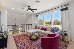
5. CONSIDER WHERE YOU WANT TO LEAD THE EYE
Color can be used to give visual cues to guide eyes where you want them to go. Tall light-colored curtains can make a room feel larger and a ceiling feels higher, like if you add molding to kitchen cabinets that match the cabinet color.For instance, leaning into the trend of the white kitchen that’s been going on, if you want to draw people’s eyes to your gorgeous large window that overlooks your garden, avoid setting anything else bright and colorful near it and instead using muted tones. The green outside will really pop against these and make the windows draw more attention. Accent walls are coming back into style and are a very simplified version of this idea.
IS THERE A WRONG WAY TO REDESIGN WITH COLOR?
Although there are plenty of loose rules about color and the way you use it, the important thing to remember is that if you’re not trying to sell your home, you can make it into anything you want it to be. If you want a home that’s full of contrasting, bright, fully saturated colors, that’s totally up to you! These color and design tips are there as a guide to help lead you towards what’s popular and what most people are enjoying or what you can do to make you home more visually interesting. If it doesn’t apply to your personal tastes, that’s okay! Just apply what applies to you.
YOUR HOME CAN BE WHATEVER YOU NEED IT TO BE
Whether you’re trying to seal the deal on a sale and get more money than you could otherwise, or you’re eager to make your home more exciting to come home to every day- these tools can help!
Lisa Thompkins is the Design Content Writer at Innovative Building Materials. With over 20 years of interior design and photography experience, Lisa has worked on many projects including commercial office design and residential spaces.
Lisa’s work has been featured in such publications as Elle Decor, Azure Magazine, Decor Magazine and Country Living.